
‘Pantone Color of the Year 2026’ - What was Intended to Bring Calm Has Infuriated the Masses

I rarely engage with trends as an artist or when decorating my home. It feels so impersonal to me. Having said this, I can see how people take inspiration from trends - it’s good to pick the bits you like and ditch the rest.
When Pantone announced their colour of the year for 2026, I thought it was a hoax. It felt like an April Fool come too soon - a cop out or even a stunt designed to get us all arguing so that their brand gets a big boost in visibility (the cynic in me was leaning this way - it certainly has resulted in a lot of chat across the internet).
Their selection doesn’t impact my creative process but I do enjoy exploring the psychology behind colour and seeing how it brings up memories and nostalgia for people. That however, does not seem to be the case with their choice (can it even be called a choice) for 2026.
I give you Cloud Dancer - or what a lot of people are now referring to as Landlord White because of it’s complete neutrality and lack of personality.
Don’t get me wrong, white has it’s place. I have white woodwork in my home and often use white frames so that the colour in my artwork has room to breathe. It is NOT, however, worthy of being colour of the year.
White can look clean for maybe 2 minutes but it saps energy. The team at the Pantone Color Institute says Cloud Dancer is meant to evoke calm, clarity, and a fresh start - a “clean slate” in a noisy world. I beg to differ and so do a lot of others.
The independent describes the choice as ‘uninspired’ and many have cited it as an indication of recession. Some have gone as far as to make links to racism however the leadership at Pantone includes women of black and asian origin so this seems to be reading too far.
colorpsychology.org explain that white “has the property of bringing calmness, comfort, and hope. It acts like a real medicine that soothes your hurt sole, and it will give your life a sense of order and meaning, helping to de-clutter from all the negative aspects. It will offer an inner cleansing, for your thoughts and soul, being the ultimate source of pure energy. But too much of it can have a negative aspect of emptiness and isolation, a sterile and ignorant environment.”
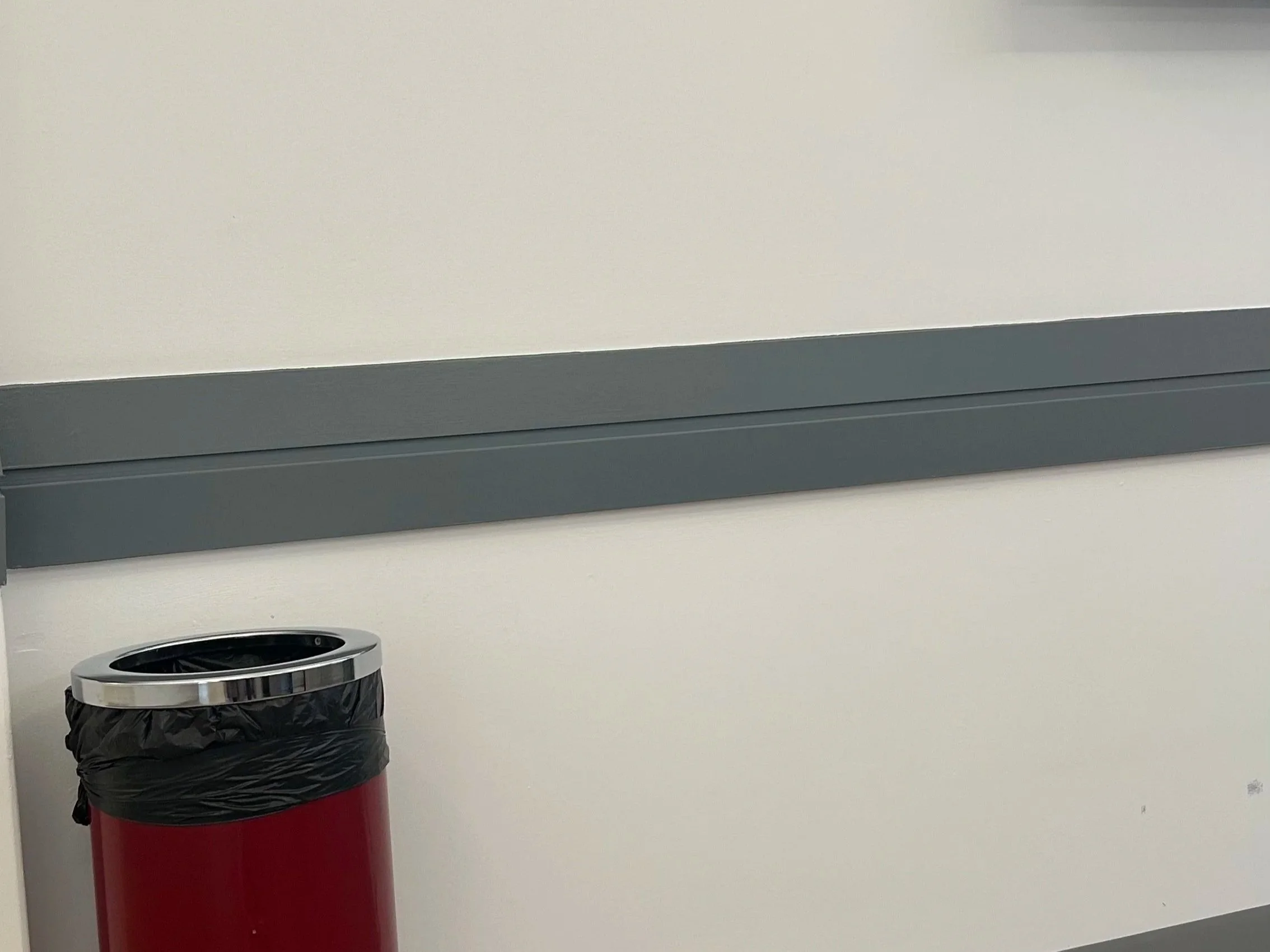
Sterile and clinical are not words I want to associate with any part of my colourful life outside of the doctors. To be honest, I wish they’d splash some colour about too -at least in the waiting rooms. It’s unpleasant enough going to a medical facility without the depressing sight of boring walls. How is anyone supposed to feel happy and healthy in a space where the only colour comes from the bin?
In a world where colour drenching is big, is the problem that we see this suggested colour and expect to plaster it everywhere rather than simply explore it’s possibilities or is it more a case that Pantone seem to have had an epic fail in suggesting that white could be enough to be symbolic of a whole year?

My recommendation is that you choose with your gut not with the trends - something that I say over and over in my digital lifestyle magazine, The Curated Nest. Every quarter it brings together inspiration from artists, designers, nature and architecture and celebrates independent creatives.
Every home and person is unique. Choose colours that bring a smile to your face without worrying about the resale of your home or what small minded people might say in criticism of your outfit.
If you are a lover of all this colour and nostalgia, then take a moment to explore my artwork. It’s intended to boost your mood and prompt happy memories or even encourage you to dream of your next adventure.

